 USU CIDI
USU Design Tools Training
2.4.13: Progress Bar
A progress bar can display the student’s progress in the course. The Progress Bar tool adds a progess bar and provides options to change the height, label, background color, and text color of the bar.

Note: Currently the progress bar values are manually entered to accomodate a wide variety of uses.
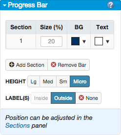
When a progress bar is added to the page, the Progress Bar panel displays the additional options. The following table explains these options.
| Progress Bar Item | Description |
|---|---|
| Section | Selects the section of the progress bar when multiple sections exist. |
| Size | Specifies the percentage of completion for the selected section of the bar. |
| BG | Changes the background color of the bar. |
| Text | Changes the color of the bar text. |
| Add Section | Adds a section divider to the bar. |
| Remove Bar | Removes the bar from the page. |
| Height | Changes the size of the bar. |
| Label(s) | Position the bar text inside or outside of the bar. This option is only available if the bar height is set to Lg. None removes any text from the bar. |
To add a progress bar
- Open the page for editing.
- Launch the USU Design Tools.
- On the USU Design Tools menu, click Progress Bar.
- In the Progress Bar panel, click Add Progress Bar.
- In the Progress Bar panel, make any desired customizations.
- Click Save.
To remove a progress bar from the page
- Open the page for editing.
- Launch the USU Design Tools.
- On the USU Design Tools menu, click Progress Bar.
- In the Progress Bar panel, click Remove Bar.
- Click Save.